Master the perfect colour scheme for your home without following trends.
“The purest and most thoughtful minds are those which love colour the most” - John Ruskin
Colour's Emotional Pull
In our first newsletter of 2023, we explore the use of colour in our homes and the impact it has on us. Have you ever noticed how a certain colour and lift your mood instantaneously? Or how other colours can take your mood down a few notches? The connection between our emotions and colour are making a huge impact within interior design schemes. I urge you to forget trends, but to pay attention to the direction your room is facing, the light and of course how the colour makes you FEEL. The impact of this emotional connection to colour should be a huge consideration when creating an interior design scheme thats personal to your home.
Colours, Colours, Colours
Yellow captures the warmth of sunlight and evokes positivity. Little Greene's Yellow-Pink used in a south/east facing bedroom has the ability to create a cocoon like warmth making it an instant mood booster. One of the strongest hues of the colour psychology spectrum is blue and it's believed to bring down blood pressure and slow respiration and heart rate. Deep, bold hues are effective at creating a sense of confidence and are linked to traits such as loyalty, trust, peace and success. Red is perhaps seen as the boldest choice yet, if used with consideration in your home and it create's the most outstanding result. Farrow & Ball's new shade Bamboozle is described as 'spirited red, the name of this fiery hue was originally used to describe the deceit of pirates. Full of buccaneering spirit, Bamboozle brings joy and warmth to any room'.
Look no further than to sought after British interior designer John Stefanidis, or the infamous editor of Harpers Bazaar Diana Vreeland, whom worked with interior designer Billy Baldwin; both indulged in rich colour schemes of fearless red filled with complimenting and clashing prints and accessories. An all encompassing warming, cosy, and relaxing atmosphere is created when red is used in the right way. Next to focus on Green not only a nod to bringing the luscious outdoors mindfully in, but the right tone can be the perfect combination of joyfulness and serenity. Artichoke by Sandserson has the most vibrant tone without being overwhelming. The perfect choice for a calming yet uplifting space to curl up in. 
Image: Billy Baldwin

Image: John Stefanidis
Embrace Colour
According to an article by WePresent they have research to suggest colour is in fact disappearing in our lives! During times of economic or political hardship we hark back to the safety and comfort of beige, greys, whites and magnolia. That it's only during times of technicolor that we celebrate colour in all its forms.
A fascinating study, yet also one I urge you to push against when it comes to your home. Stick with your emotional connection to colour and express yourself through your colour choice. Don't be afraid, embrace it. Whether thats through paint colour, soft furnishings or accessories; don't secum to society’s dullness or dyer political climate, push back and express yourself. If you feel the urge to go all out magnolia, then do it but only if it create's the right emotional pull to invigorate your space.
My Colourful Home
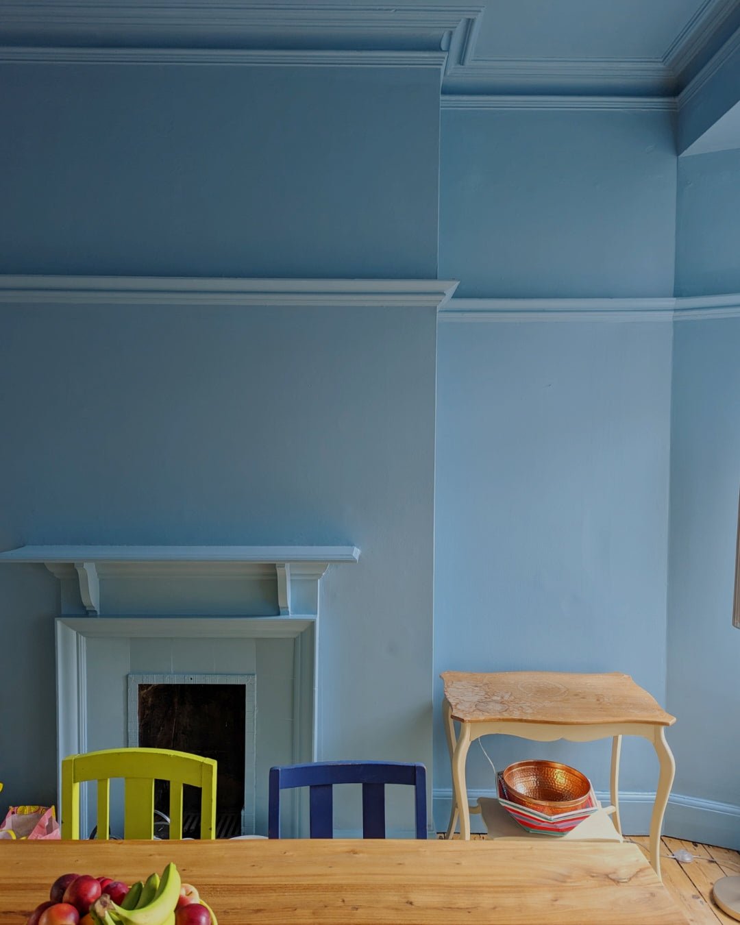
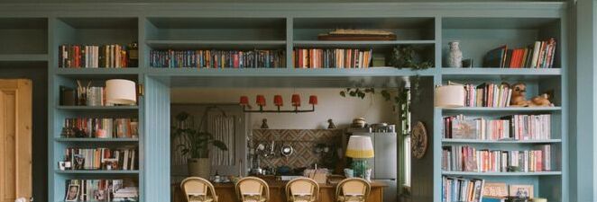
Here at APHQ we aren't afraid of a bit bold use of colour. Deep blue hues and vibrant yellows fill our homes, offset amongst neutral pink's and calming white tones. We engulf our homes with colour as we believe that it has a positive impact of our everyday life. How many times have you walked in to a bright yellow room and immediately felt happy, or joyful? Or walked in to a deep blue cocoon and felt instantly relaxed? The psychological impact colour has on our mood is fascinating. It can change the course of our day, a week or month.

Image: Appreciation Project
My top tips for decorating with bold colours is are these; Firstly, to completely bathe a room in colour from ceiling, walls, woodwork and doors. Or alternatively, paint the walls, skirting, dado and picture rails, doors and window frames in the bold colour and from the frieze and cornice upwards including the ceiling keep in a more neutral tone. Both of these options will then allow you to have a surprisingly easy canvas of a backdrop to then dress the room confidently with all your favourite objects, art and furniture. You don't need to be overly concerned with 'matching' because the strong use of the colour will mean that whatever you place in front of it with naturally harmonise. 
Image: Appreciation Project
Image: Studio Olive
Find Your Colour
Want to get your project off the ground in an hour? Appreciation Project offer an in person or remote interior design consultancy geared to help you get your new project off to a confident start. Founder and creative director, Natasha has colour expertise that have been well honed over a 20 year career in design for the fashion industry as well as renovating various homes. Let's figure out your colour scheme and tell your story together.
This Month's Inspiration
BOOK - The Colourful Past, Edward Bulmer and the English Country House. The most perfect stocking filler. Hint.
GETAWAY - Remember in the film The Holiday, when Cameron Diaz enquires about an idillic country house in England? Well I think this glorious boutique guest house more than ticks that box. A most indulgent retreat to recharge set in the heart of Devon. This is going on my 2023 escape wish list.
EXHIBITION- The Design Museum, Objects of desire; Surrealism and Design 1924-today. A terrific celebration of designs, but nostalgic and iconic.


